
Why the Same App Looks Different on iPhone and Android

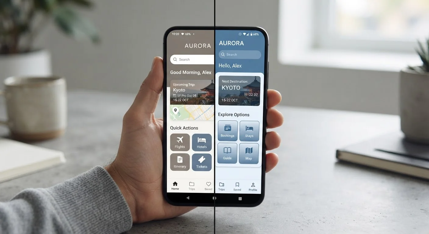
Photo: AdvisorBooth.net editorial
Key Takeaways
- Apple and Google each publish distinct design guidelines that shape how apps look and behave on their platforms.
- Developers often build separate versions of the same app to match each platform's conventions.
- Navigation patterns, button placement, and gesture controls differ meaningfully between iOS and Android.
- These differences are intentional - they make apps feel native and familiar to each platform's users.
- Some cross-platform apps prioritize consistency over convention, making them look nearly identical on both systems.
Two Platforms, Two Rulebooks
When you download the same app on an iPhone and an Android device, you're not just running the same software on different hardware. You're often using a version of the app specifically designed and optimized for each operating system - complete with different visual layouts, navigation styles, and interaction patterns.
This happens because Apple and Google each publish formal design guidelines that define how apps should look and behave on their platforms. Apple's are called the Human Interface Guidelines; Google's framework is called Material Design. These aren't vague suggestions - they're detailed specifications covering everything from how menus animate to the exact spacing between buttons.
Developers who follow these guidelines produce apps that feel native - meaning they blend naturally into the environment users already know. An app that ignores them can feel clunky or out of place, even if it technically works. For a deeper look at what goes into building apps for specific platforms, see our explainer on native vs. web apps.
Navigation Is the Most Visible Difference
The most immediately noticeable gap between iOS and Android apps is navigation. On Android, users have long relied on a system-level back button - either a physical key or a swipe gesture managed by the OS itself. iOS has no universal back button; instead, apps display their own back controls, typically in the upper-left corner of the screen.
This single difference cascades through an app's entire layout. An Android app might not need an on-screen back arrow for certain flows because the system handles it. The same app on iPhone must build that navigation element directly into the interface. Neither approach is wrong - they simply reflect the assumptions each platform makes about how users move around.
Tab bars, bottom sheets, and menu drawers also behave differently. iOS tends to place tab bars at the bottom of the screen. Android apps, particularly older ones, often used a side-sliding navigation drawer. More recently, Material Design has shifted Android toward bottom navigation as well - showing that these conventions do evolve over time.
2
Separate design frameworks developers must learn
Apple's Human Interface Guidelines and Google's Material Design are both extensive, regularly updated specifications that define platform-specific UI behavior.
~70%
Global smartphone market share held by Android
According to Statcounter's global mobile OS data, Android consistently accounts for roughly 70% of worldwide smartphone usage, making cross-platform design decisions commercially significant.
Billions
Apps available across both major app stores
Apple's App Store and Google Play each host millions of apps, the majority of which are available on both platforms in some form.
Why Developers Make Different Choices for Each Platform
Building and maintaining separate apps for iOS and Android is expensive and time-consuming. So why do most major apps still do it? Because users notice when something feels wrong. Buttons in unfamiliar places, animations that don't match the OS rhythm, or fonts that clash with the system style all create subtle friction that erodes trust in the product.
Some development teams use cross-platform frameworks - tools that let them write code once and deploy it on both systems. These approaches have improved significantly, but they often involve trade-offs: the app may look nearly identical on both platforms, which can feel slightly foreign to users on each one. This is a common reason why the app you use every day on your iPhone might feel a little generic compared to apps built exclusively for iOS.
Understanding what kind of app you're using - native or cross-platform - can help explain these quirks. Our guide to what happens when you install an app covers more about how apps are packaged and delivered to your device.
Notice the Differences in Apps You Already Use
When Consistency Wins Over Convention
Not every company follows platform conventions strictly. Some brands - particularly those with strong visual identities - deliberately design their apps to look consistent across both platforms, prioritizing brand recognition over native feel. You'll recognize these apps immediately: they look virtually identical whether you're on an iPhone or an Android phone.
This is a deliberate product decision, not an oversight. The trade-off is that these apps can feel slightly at odds with the rest of your phone's interface. Permissions prompts, notifications, and system dialogs will still follow your phone's OS conventions even inside a brand-consistent app - which can occasionally create a jarring switch. For more on how those system-level interactions work, see what those permission screens actually mean.
Ultimately, the differences you notice between an app on iPhone and Android aren't bugs or accidents. They're the result of deliberate design decisions - by the platform makers who set the rules and by the developers who choose how closely to follow them.
“Design is not just what it looks like and feels like. Design is how it works.”
— Steve Jobs, Co-founder, Apple Inc.
Frequently Asked Questions
The content on this site is for informational purposes only and is not a substitute for professional advice. Always consult a qualified professional for guidance specific to your situation.